Atmos
Exploring how bookmarks can evolve to support the way we browse and save content today

User Research & Requirements
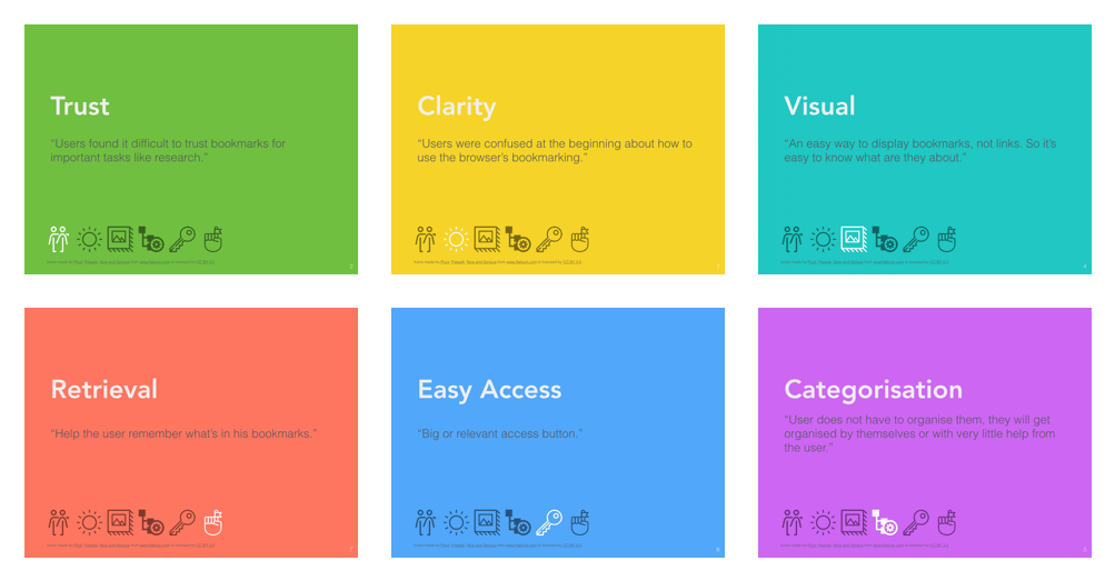
I spoke to 4 users in order to understand how they stored information for later retrieval, and specifically, their practices around browsing and bookmarking on the web. A critical insight from this phase was how similar bookmarks are to information scraps (Bernstein et al., 2008). Like bookmarks, these scraps constantly elude the tools we use to manage them. Their purpose also varies from temporary storage to reminding and archival.
Lightweight Capture
Lower time and effort to capture
Flexible use
Cater to personal organisation systems.
Flexible representation
Bookmarks vary in content and type.
Visibility & Reminding
Prime information for later
Mobility and availability
Allow use in mobile contexts
Ideation & Concept Development
Clusters & Relationships
The metaphor of nodes and clusters offers rich opportunities for user interaction. Users can explore relationships in the content they have saved, or find content in clusters of other users. The clusters themselves can also be objects a user can act on - sharing an entire cluster for example.
Logo & Brand
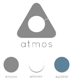
The brand is an attempt to capture a user's journey across the internet as an act of exploration. Starting from the circular form, which looks like atoms and molecules floating in space, the logo represents the internet as a set of linked web pages.
The final logo is an abstract representation of the letter 'A'. The space inside the shape represents a storage container. The line leading out of the space highlights relationships and a passage way between the contents of the store and the outside world.
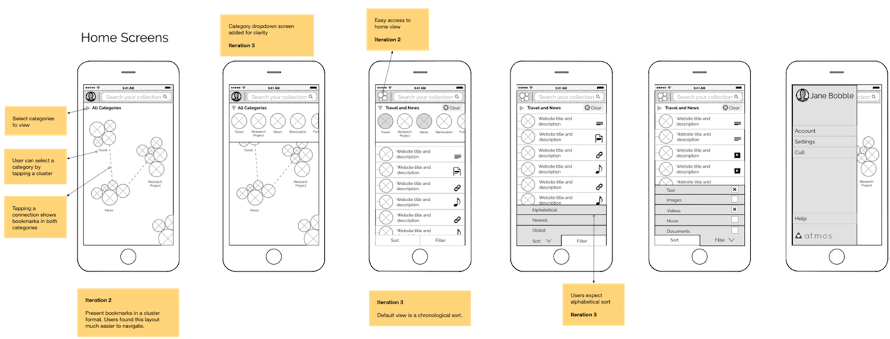
High Fidelity Mockups & Interactive Prototype
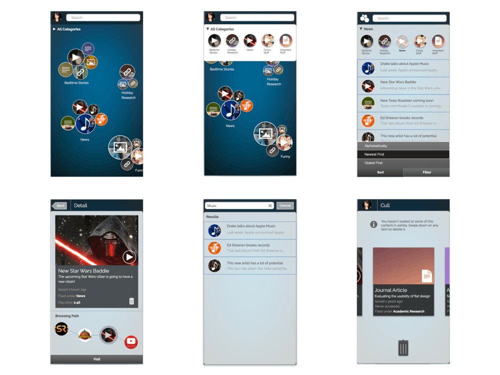
A total of 10 screens were built. The design was further refined through input from users, literature research and drawing from design patterns and theory. For example, the category toggle was dropped and the bottom toolbar was re-designed to offer primary navigation controls.
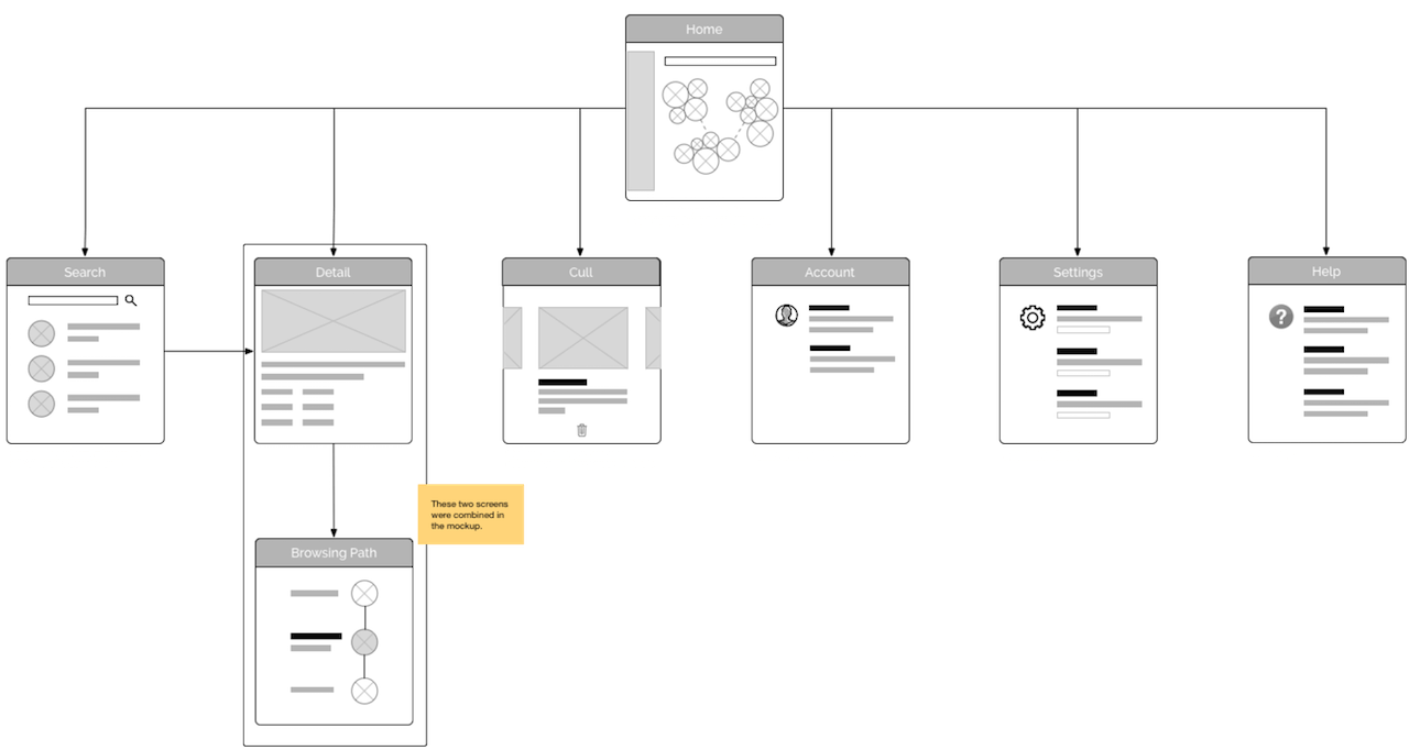
An interactive prototype was also implemented using HTML, CSS and Javascript. I used Meteor for rapid prototyping. 8 screens were built to test the interactions in the navigation, retrieval and search flows in the application.
